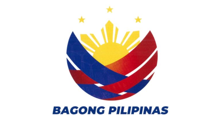
Amidst the PAGCOR logo fiasco, President Ferdinand Marcos Jr. unveiled the Bagong Pilipinas logo, his administration’s official brand of governance and leadership.
Bagong Pilipinas
Bagong Pilipinas was the president’s election campaign slogan and is now the “overarching theme of the Administration’s brand of governance and leadership, which calls for deep and fundamental transformations in all sectors of society and government”. This is according to Memorandum Circular No. 24.
The Presidential Communications Office (PCO) clarified that this was accomplished without any cost to the government as it was “produced internally”.

The PCO also explained the symbolism of the logo:
- three red stripes refer to the country’s post-war agricultural and rural development, the post-colonial period, and the current metropolitan development
- blue stripes signify “progressive Philippines that leverages technological advancement in pursuing sustainable industrial development.”
- rising sun is the new dawn of a new Philippines
- weave pattern that illustrates the interconnectedness and unity of the Filipino people.
Simply put the PCO puts it, “Overall, the Bagong Pilipinas logo embodies the Marcos Administration’s vision for the country, emphasizing unity, involvement, and the bayanihan culture as the main fibers and components for its full realization.”
Upon closer inspection though, the blue stripes feature faint windmills and what looks to be a nuclear power plant, while the red stripes feature faint solar panels. Both of which, are speculated to be referencing the President’s push for renewable energy sources.
Previous administrations had their own slogans, among these include Rodrigo Duterte’s Change is Coming, Benigno Aquino III’s Daang Matuwid, and Joseph Estrada’s Erap Para sa Mahirap. However, these were previously just slogans. This is perhaps the first time a logo joined the administration’s logo.
Source: Gadget Pilipinas
0 Comments